Effective messages for trade show booths
Standing out at a trade show can be a challenge, especially when surrounded by many other companies all competing for the attention and interest of visitors.
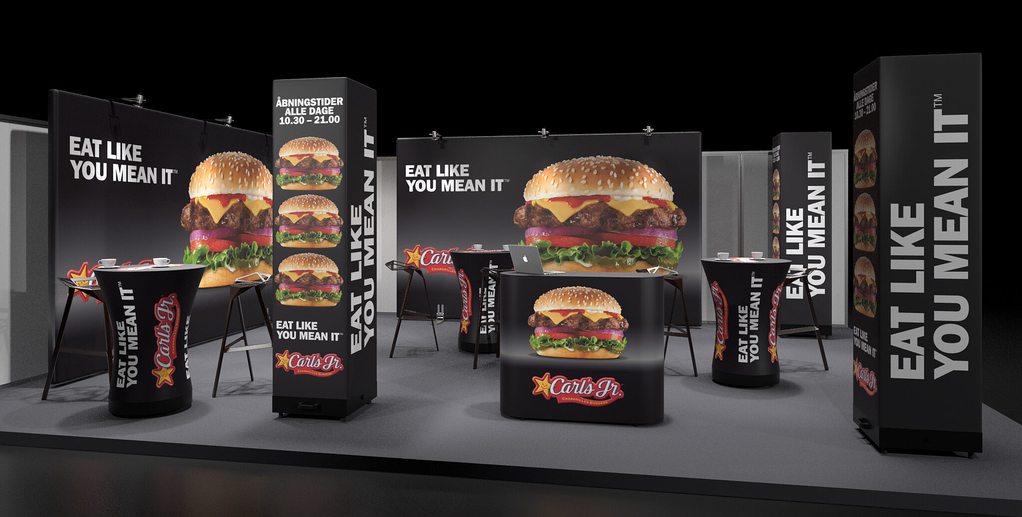
When you step into a large hall filled with competitors, the first impression your booth gives is crucial to whether people choose to stop and engage. In this blog post, we’ll explore how you can create a trade show booth that not only grabs attention but also encourages people to stick around.
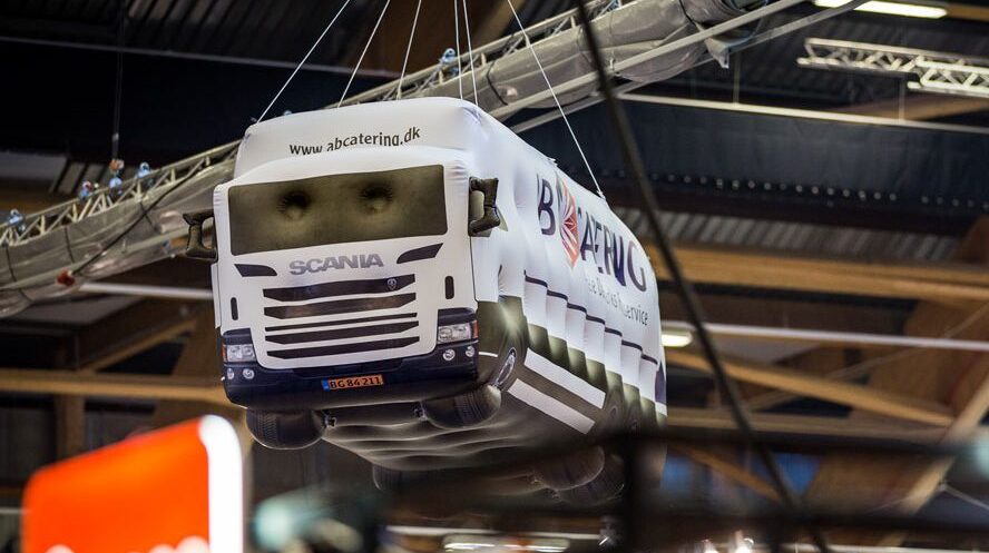
A clear and concise message: When people move around a trade show, they are bombarded with information from every booth. If your booth doesn’t have a clear and easy-to-understand message, you risk being overlooked. According to Christian Guldager from Kursuslex, it is essential to keep the message simple:
“A good booth functions like a good advertisement. You should be able to decode the message immediately.”
This means you should avoid cluttering your booth with too much information. Provide people with one or two clear reasons to stop. This could be a straightforward product description, a strong visual element, or a provocative statement that piques curiosity. The company name alone is not enough—it’s the message that needs to sell.
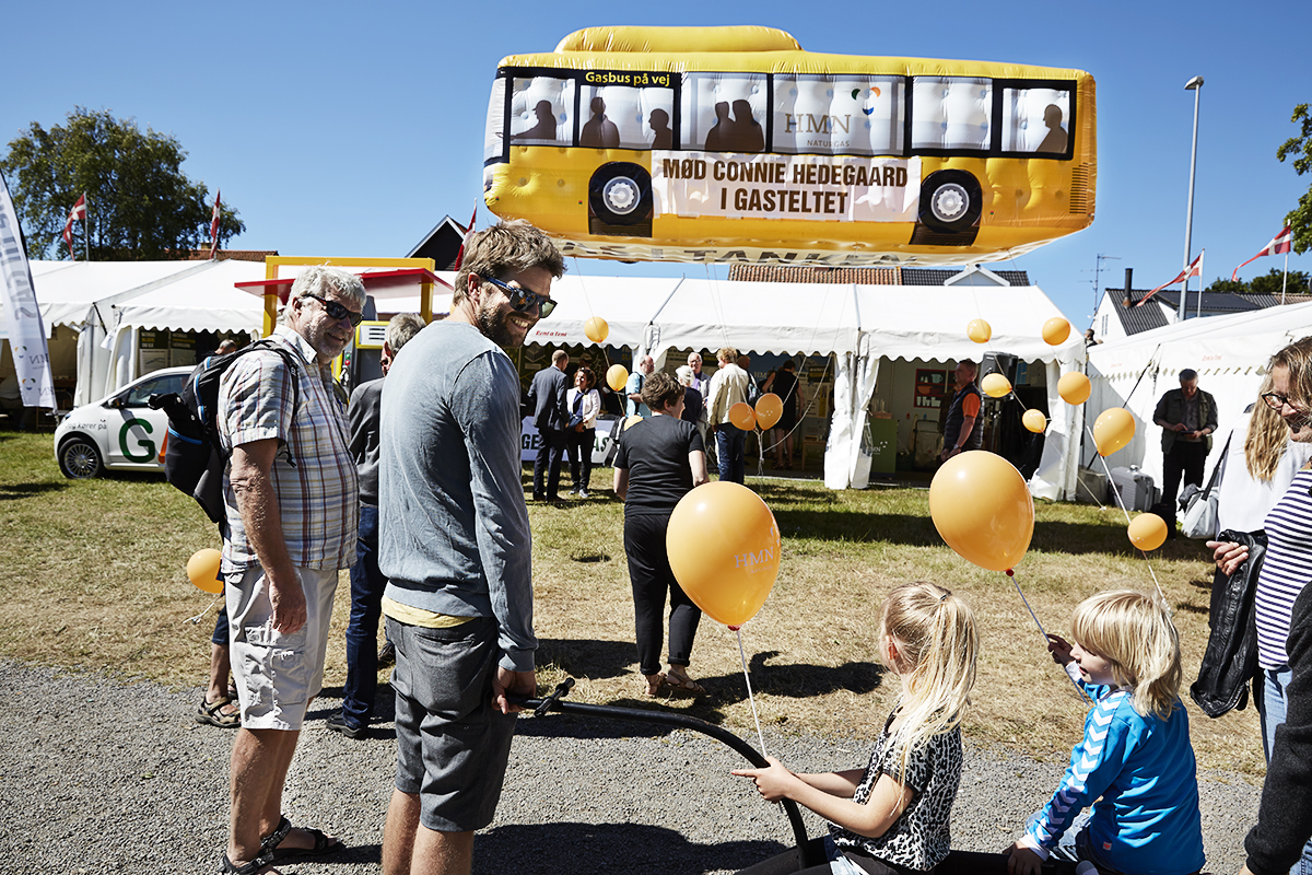
Visual design that stands out: The graphic design of your trade show booth is just as important as the words you choose to communicate with. A consistent thread throughout the visual expression creates recognition and professionalism. Consider how colors, images, and text can work together to tell a cohesive story. Remember, the visual design should support your message—not overshadow it.
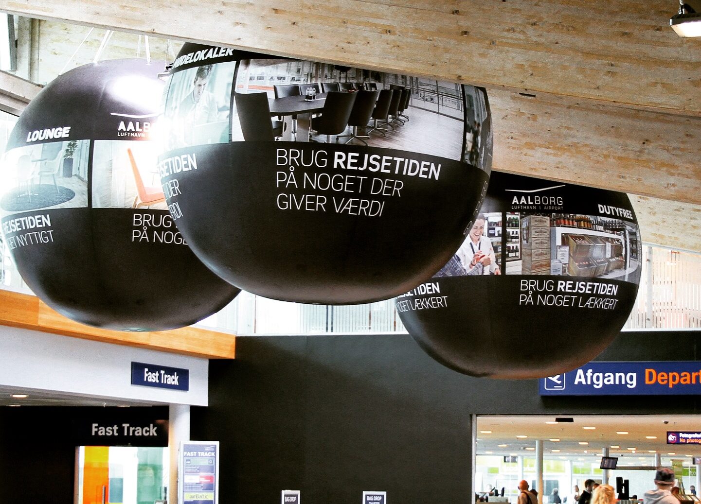
Examples of successful booths: A great example of a company that has managed to stand out at trade shows is SACKit. They have learned that when they bring too many products at once, the message gets diluted. Instead, they have chosen to focus on fewer products in their booths, making it easier for visitors to decode what is at stake. This is an important lesson: too many elements can create confusion, while a focused message makes it easier for people to understand why they should engage.
Email your questions
to our inbox
Your reply is often ready within 1 working
day. All questions are welcome.

